How to Choose the Right Color Palette for Your Brand

Hao Ta
Mar 15, 2022
Color is one of the most influential aspects of branding. It shapes perceptions, triggers emotions, and creates brand recognition. Choosing the right color palette isn’t just about aesthetics—it’s about communication. Whether you’re designing a logo or a full brand identity, understanding color psychology can help create a strong and cohesive brand presence.
The Psychology Behind Colors
Different colors evoke different emotions. Blue represents trust and stability, making it a favorite in corporate and financial branding. Red signals energy and excitement, often used in fast-food and entertainment industries. Green conveys growth and health, ideal for eco-friendly and wellness brands. By understanding these associations, designers can select colors that reinforce a brand’s message and values.
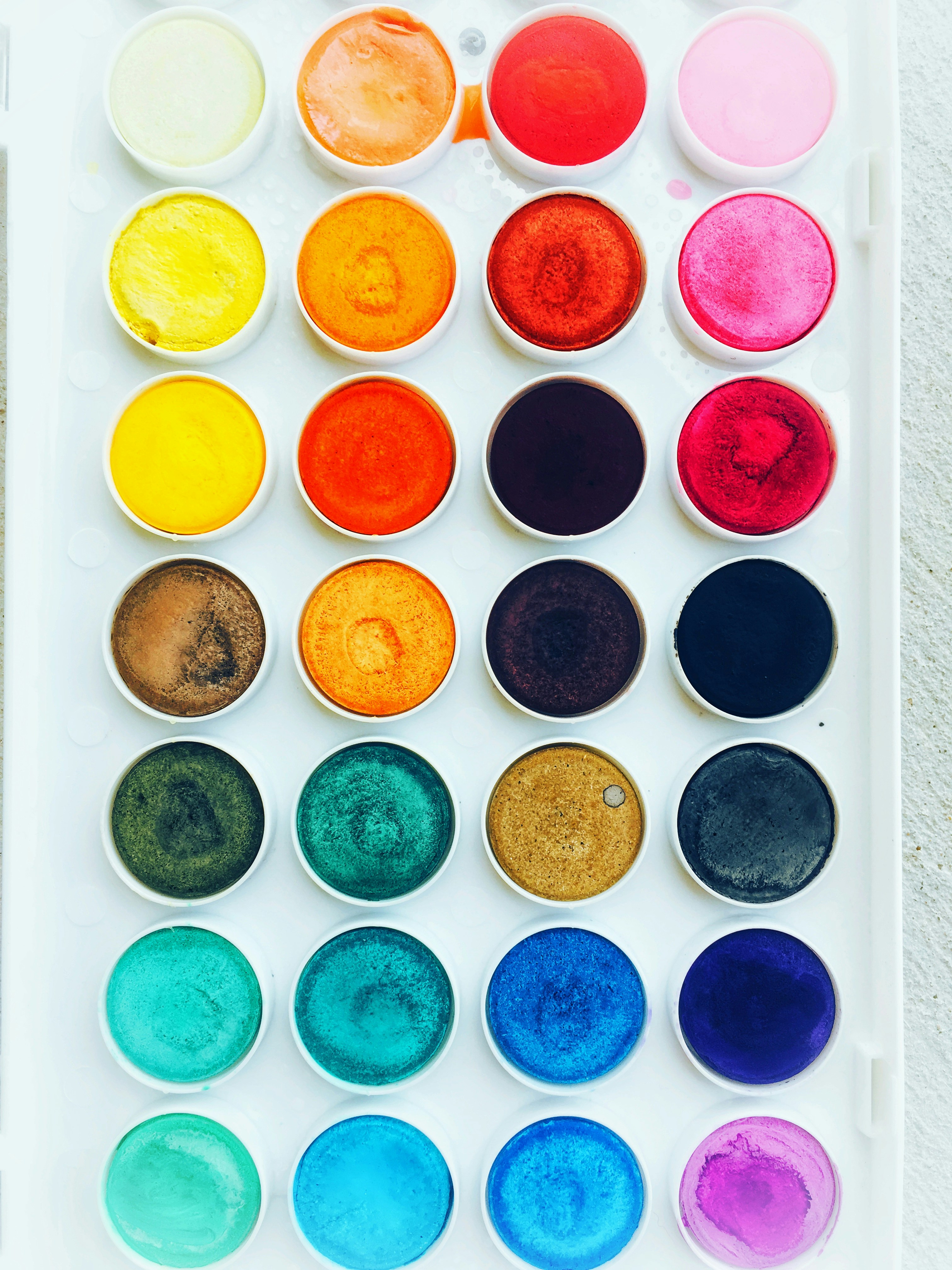
Creating a Cohesive and Versatile Color Palette
A brand’s color palette should be functional across all applications. It should include a primary color (the dominant brand color), secondary colors for variation, and neutral tones for balance. Test colors in different contexts, ensuring they work well in digital and print formats. Contrast and accessibility should also be considered—your color choices should be legible and inclusive for all audiences.
Color is a powerful branding tool that can shape consumer perceptions. By mastering color psychology and choosing a versatile palette, designers can create impactful and cohesive brand identities. The right colors don’t just look good—they tell a story.