Why your brand color looks different everywhere

Hao Ta
Mar 15, 2022
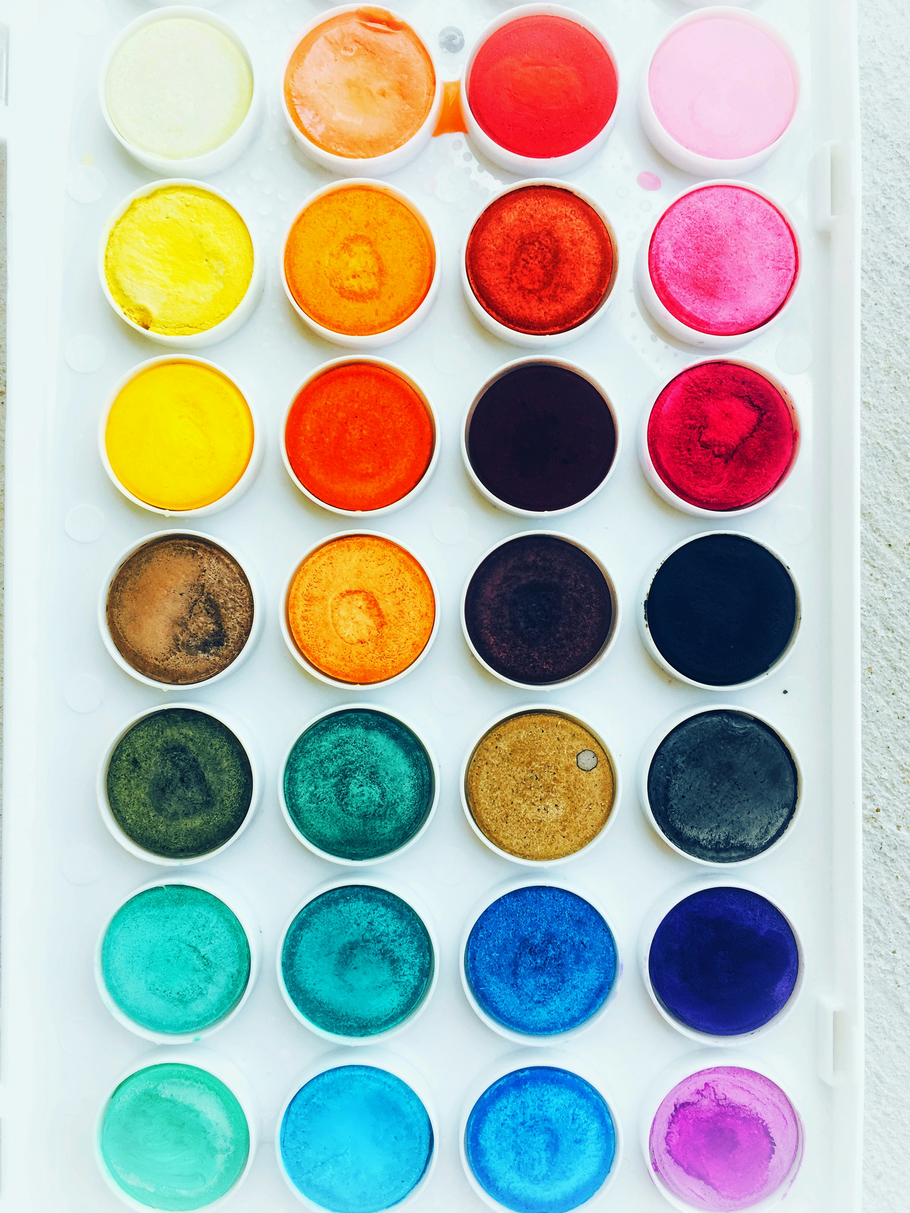
Every brand book has a page with the colour swatches. Almost nobody has the page that explains why the colour on the sign does not match the colour in the app.
One color, five versions
The same brand color has to survive a screen, a printed page, a painted wall, a backlit sign, and a fabric. Those are five different physical processes, and none of them produce the same result.
A screen emits light. A printed page reflects it. That is the fundamental difference, and it means your screen color will always look more vivid than the printed version.
A backlit sign at dusk is lit from behind. Your blue turns lighter and cooler than it is on paper. The same blue at noon looks flat and darker.
Fabric absorbs ink differently, so a color that is crisp on a card can look washed out on a shirt.
Paint is mixed by a human in a shop, from a formula, and it will drift each time somebody mixes a new batch.
Why this matters more than the swatch
Because the moment a customer meets your brand is usually the moment it renders wrong.
They see the app icon in a photo on a booking site, compressed and color-shifted. They see the sign from thirty meters in rain. They see the menu under warm restaurant lighting, which makes everything look yellow.
If your brand depends on one exact color landing perfectly, it will fail almost every time it appears.
What I do instead
Design a range rather than a single value.
A primary color, plus a small set of variants that are each tuned for a context: one for screen, one for print, one for large-format signage. Then specify the material alongside the color, because "brand blue" means nothing on a backlit panel unless you say what the panel is made of.
And test it in the real place before production. A photo of the wall, in the light it will actually sit in, at the time of day most people will see it. This has saved me more rebuilds than any amount of color theory.
The uncomfortable bit
The color that looks best on your screen in the design presentation is often the one that fails worst in production.
That is a hard thing to tell a client who has fallen in love with a specific shade. But the alternative is a brand that looks right in one place and slightly wrong everywhere else, which is how brands end up feeling cheaper than they are.